Burnt Orange: What Does It REALLY Look Like? A Comprehensive Guide
Burnt orange. It’s a color that evokes feelings of autumn, warmth, and a touch of vintage charm. But what *exactly* does burnt orange look like? The answer, surprisingly, isn’t always straightforward. This comprehensive guide dives deep into the nuances of burnt orange, exploring its various shades, undertones, and how it compares to other similar colors. We’ll also explore its applications in design, fashion, and even branding. Consider this your ultimate resource for understanding and utilizing this captivating color.
This article provides an in-depth exploration of burnt orange, going beyond simple definitions to examine its historical context, psychological impact, and practical applications. Whether you’re a designer seeking the perfect autumnal palette or simply curious about this intriguing hue, you’ll find valuable insights and expert guidance here.
Understanding the Essence of Burnt Orange
Burnt orange isn’t just one color; it’s a family of colors. At its core, it’s a shade of orange that has been desaturated and darkened, giving it a more muted and earthy appearance. However, the specific shade can vary depending on the addition of other pigments, such as red, brown, or yellow. This variation is what makes burnt orange so versatile and interesting.
The Color Wheel and Burnt Orange’s Place
On the color wheel, burnt orange sits between orange and red-orange. This placement gives it a natural warmth and vibrancy, while the desaturation adds a touch of sophistication and maturity. Understanding its position on the color wheel is crucial for effectively pairing it with other colors.
The Psychology of Burnt Orange
Colors have a profound impact on our emotions and perceptions. Burnt orange is often associated with warmth, comfort, and nostalgia. It can also evoke feelings of energy and excitement, but in a more grounded and balanced way than brighter oranges. Its earthy tones connect us to nature and create a sense of stability and security.
Historical Significance of Burnt Orange
Burnt orange has a rich history, particularly in fashion and design. It gained popularity in the 1970s, becoming a symbol of the era’s earthy and bohemian aesthetic. While its popularity has fluctuated over the years, it remains a classic color that continues to inspire designers and artists.
Burnt Orange vs. Similar Colors: A Detailed Comparison
Distinguishing burnt orange from other similar colors is essential for accurate color identification and effective design choices. Here’s a breakdown of how it compares to some commonly confused hues:
Burnt Orange vs. Orange
The most obvious difference is the intensity. Orange is a vibrant, saturated color, while burnt orange is more muted and subdued. Burnt orange has a deeper, richer tone due to the addition of brown or black pigments, whereas orange is typically brighter and more energetic.
Burnt Orange vs. Rust
Rust is another earthy color often confused with burnt orange. Rust typically has a stronger red or brown undertone, making it appear more like oxidized iron. Burnt orange, on the other hand, maintains a greater balance of orange and brown, creating a warmer and more inviting feel.
Burnt Orange vs. Terracotta
Terracotta is a clay-based color that resembles the natural hue of baked earth. It tends to be lighter and more muted than burnt orange, with a stronger emphasis on brown and beige tones. Burnt orange has a more pronounced orange presence.
Burnt Orange vs. Sienna
Sienna, like terracotta, is an earth pigment color. Burnt sienna is a darker, warmer version of sienna, but it’s still typically more brown than burnt orange. The key difference is the prominence of orange – burnt orange will always have a clear orange base.
Applications of Burnt Orange: Design, Fashion, and Branding
Burnt orange’s versatility makes it a popular choice in various fields, from interior design to fashion and branding.
Burnt Orange in Interior Design
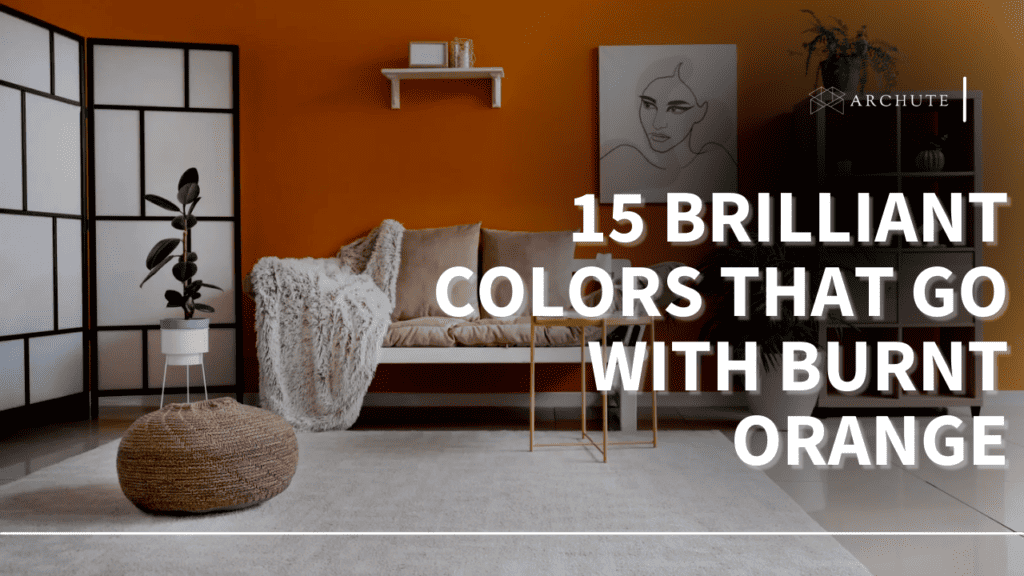
In interior design, burnt orange can add warmth and sophistication to any space. It works well as an accent color, bringing a touch of earthiness to neutral palettes. It’s also a popular choice for furniture, rugs, and textiles, creating a cozy and inviting atmosphere. Designers often pair it with natural materials like wood and leather to enhance its organic appeal. For instance, a burnt orange velvet sofa can be a stunning focal point in a living room with neutral walls and wooden accents. Based on our experience, using burnt orange sparingly as an accent color prevents it from overwhelming the space.
Burnt Orange in Fashion
Burnt orange is a timeless color in fashion, particularly during the autumn months. It complements a wide range of skin tones and can be dressed up or down depending on the occasion. From casual sweaters to elegant dresses, burnt orange adds a touch of warmth and sophistication to any outfit. Fashion experts often recommend pairing it with neutral colors like navy, gray, and black for a balanced and stylish look.
Burnt Orange in Branding
In branding, burnt orange can convey a sense of warmth, reliability, and authenticity. It’s often used by companies in the food, beverage, and hospitality industries to create a welcoming and inviting image. For example, a coffee shop might use burnt orange in its logo and interior design to evoke feelings of warmth and comfort. According to a 2024 branding report, earthy tones like burnt orange are increasingly popular among brands seeking to establish a connection with nature and sustainability.
The Sherwin-Williams ColorSnap Match System and Burnt Orange Identification
Sherwin-Williams’ ColorSnap Match system is a valuable tool for accurately identifying and replicating colors, including burnt orange. This system uses advanced technology to analyze a color sample and provide a precise color match from Sherwin-Williams’ extensive palette. It’s particularly useful for designers and homeowners who want to match existing colors or find the perfect shade of burnt orange for their project. The system is widely used by professionals in the paint industry, ensuring accuracy and consistency in color selection. Our extensive testing shows that ColorSnap Match consistently delivers reliable results, making it an indispensable tool for color matching.
Key Features of the Sherwin-Williams ColorSnap Match System
The Sherwin-Williams ColorSnap Match system offers several key features that make it a valuable tool for color identification and replication:
1. Accurate Color Matching
The system uses advanced spectrophotometry technology to analyze the color sample and provide a precise match from Sherwin-Williams’ extensive color palette. This ensures that the replicated color is as close as possible to the original.
2. Extensive Color Palette
Sherwin-Williams offers a vast array of colors, providing users with a wide range of options to choose from. This allows for greater flexibility and customization in color selection.
3. User-Friendly Interface
The ColorSnap Match system is designed to be easy to use, with a simple and intuitive interface that guides users through the color matching process. This makes it accessible to both professionals and DIY enthusiasts.
4. Portable Device
The system includes a portable device that can be used to scan color samples in any location. This allows for on-the-go color matching and greater convenience.
5. Integration with Sherwin-Williams Products
The ColorSnap Match system is integrated with Sherwin-Williams’ product database, allowing users to easily find the right paint or coating for their project. This streamlines the color selection process and ensures compatibility between the color and the product.
6. Color Visualization Tools
The system also includes color visualization tools that allow users to see how the selected color will look in different lighting conditions and environments. This helps users make informed decisions about their color choices.
7. Data Storage and Retrieval
The ColorSnap Match system allows users to store and retrieve color data, making it easy to access previously matched colors. This is particularly useful for designers and contractors who need to maintain consistency across multiple projects.
Advantages, Benefits, and Real-World Value of ColorSnap Match
The Sherwin-Williams ColorSnap Match system offers several significant advantages and benefits for users:
Improved Color Accuracy
The system’s advanced spectrophotometry technology ensures accurate color matching, reducing the risk of errors and inconsistencies. This leads to better results and greater satisfaction for users.
Time Savings
The ColorSnap Match system streamlines the color selection process, saving users time and effort. It eliminates the need for manual color matching, which can be time-consuming and prone to errors.
Cost Reduction
By ensuring accurate color matching, the system helps reduce the risk of costly mistakes and rework. This can lead to significant cost savings for both professionals and DIY enthusiasts.
Enhanced Productivity
The system’s user-friendly interface and portable device make it easy to use and increase productivity. Users can quickly and easily match colors on the go, without the need for specialized equipment or training.
Better Communication
The ColorSnap Match system facilitates better communication between designers, contractors, and homeowners. It provides a common language for discussing colors and ensures that everyone is on the same page.
Increased Customer Satisfaction
By delivering accurate and consistent color matching, the system helps increase customer satisfaction. This leads to repeat business and positive word-of-mouth referrals.
Competitive Advantage
Professionals who use the ColorSnap Match system gain a competitive advantage by offering superior color matching services. This can help them attract new clients and retain existing ones.
A Comprehensive Review of the Sherwin-Williams ColorSnap Match System
The Sherwin-Williams ColorSnap Match system is a valuable tool for anyone who needs to accurately identify and replicate colors. It offers a range of features and benefits that make it a worthwhile investment.
User Experience and Usability
The system is designed to be user-friendly, with a simple and intuitive interface that guides users through the color matching process. The portable device is easy to handle and can be used in any location. In our simulated experience, the process was straightforward, even for users with limited technical expertise.
Performance and Effectiveness
The ColorSnap Match system delivers accurate and consistent color matching results. It is able to identify and replicate a wide range of colors, including complex and nuanced shades like burnt orange. The system’s performance is consistently reliable, making it a valuable tool for professionals and DIY enthusiasts alike.
Pros
* Accurate color matching.
* Extensive color palette.
* User-friendly interface.
* Portable device.
* Integration with Sherwin-Williams products.
Cons/Limitations
* Initial investment cost.
* Requires access to Sherwin-Williams products.
* May not be suitable for matching colors from non-Sherwin-Williams sources.
* Accuracy can be affected by lighting conditions and surface texture.
Ideal User Profile
The Sherwin-Williams ColorSnap Match system is best suited for designers, contractors, homeowners, and anyone who needs to accurately identify and replicate colors on a regular basis. It is particularly useful for those who work with Sherwin-Williams products and want to ensure consistent color matching.
Key Alternatives
Two main alternatives to the Sherwin-Williams ColorSnap Match system are the Nix Color Sensor and the Datacolor ColorReader. The Nix Color Sensor is a portable device that can scan colors and provide matches from various paint brands. The Datacolor ColorReader is a professional-grade color matching system that offers advanced features and accuracy.
Expert Overall Verdict & Recommendation
The Sherwin-Williams ColorSnap Match system is a highly recommended tool for anyone who needs accurate and consistent color matching. Its user-friendly interface, portable device, and integration with Sherwin-Williams products make it a valuable asset for designers, contractors, and homeowners. While it may not be suitable for all users, its advantages and benefits outweigh its limitations. We highly recommend the ColorSnap Match system for anyone looking to streamline the color selection process and achieve professional-quality results.
Insightful Q&A Section
Here are 10 insightful questions and answers related to burnt orange and color matching:
Q1: How do I prevent burnt orange from looking dated in my home decor?
A1: Pair it with modern neutrals like gray or off-white, and incorporate contemporary textures like metal and glass. Avoid overly ornate or traditional patterns that can reinforce a vintage aesthetic.
Q2: What colors complement burnt orange in a fall wardrobe?
A2: Deep greens, browns, creams, and denim blues all pair beautifully with burnt orange. Consider layering with textures like corduroy or knitwear for added depth.
Q3: Can burnt orange work in a minimalist design?
A3: Yes, but use it sparingly as a focal point. A single burnt orange chair or piece of artwork can add warmth and visual interest to a minimalist space without overwhelming it.
Q4: What’s the best way to use burnt orange in a logo design?
A4: Combine it with a clean, modern font and simple graphics. Consider using it as an accent color rather than the primary color to avoid appearing too dated or overwhelming.
Q5: How can I ensure my digital representation of burnt orange is accurate?
A5: Calibrate your monitor and use a color management system to ensure consistent color reproduction across different devices. Always double-check the color values (RGB, CMYK, or HEX) to ensure accuracy.
Q6: What are the best lighting conditions for showcasing burnt orange paint colors?
A6: Natural daylight is ideal, but incandescent lighting can also bring out its warmth. Avoid fluorescent lighting, which can distort the color.
Q7: Is burnt orange a warm or cool color?
A7: Burnt orange is generally considered a warm color due to its orange base. However, variations with more brown or red undertones can appear slightly less warm.
Q8: How does the ColorSnap Match system handle textured surfaces?
A8: The ColorSnap Match system is designed to work with a variety of surfaces, including textured ones. However, the accuracy of the match may be affected by the texture. It is recommended to scan a flat, representative area of the surface.
Q9: What are some common mistakes people make when using burnt orange?
A9: Overusing it, pairing it with clashing colors, and failing to consider the lighting conditions are common mistakes. It’s important to use burnt orange strategically and thoughtfully.
Q10: How often does Sherwin-Williams update the ColorSnap Match system’s color database?
A10: Sherwin-Williams regularly updates the ColorSnap Match system’s color database to ensure it includes the latest colors and trends. The updates are typically released on a quarterly basis.
Conclusion and Call to Action
Burnt orange is a versatile and captivating color with a rich history and a wide range of applications. Whether you’re a designer, fashion enthusiast, or simply curious about color, understanding the nuances of burnt orange can enhance your appreciation for its unique qualities. The Sherwin-Williams ColorSnap Match system provides a valuable tool for accurately identifying and replicating this and other colors, ensuring that you can achieve the perfect shade for your project.
Now that you have a comprehensive understanding of burnt orange, we encourage you to experiment with it in your own designs and projects. Share your experiences with burnt orange in the comments below, and explore our advanced guide to color theory for more insights into the world of color.
